Step 2. Building the block for Mobile
About Flex Block mobile version
With the FlexBlock you have full control over the mobile version of your block. You can even create a mobile version that will differ from the desktop one, to provide a better user experience for your mobile users.
When you switch to the mobile tab in your top bar, the mobile version of your custom block will be empty. If you save it as it is, it will unfortunately be displayed empty on your actual website when viewed on mobile.
NOTE: Flexthemes have predefined blocks, and the mobile layout is preconfigured there. For new flex blocks built from scratch, mobile is empty and has to be built manually.
If you skip the mobile version building step (when working with flex blocks that are built from scratch), don’t expect that your mobile version will be created automatically. This is due to the extra freedom that FlexBlock offers you when designing a block. There are no rules while you create your custom block layouts (no mater how unreal your idea is). Hence, moving such content automatically to a mobile version can lead to unexpected results.
But worry not, we plan to build some smart solution for this with our next FlexBlock version. For now, we’re keeping it simple as you’re getting used to working with this amazing & powerful tool.
Building the mobile version
Building the mobile version is not complicated and doesn’t force you to recreate the content. However, you will need to build the layout for mobile:
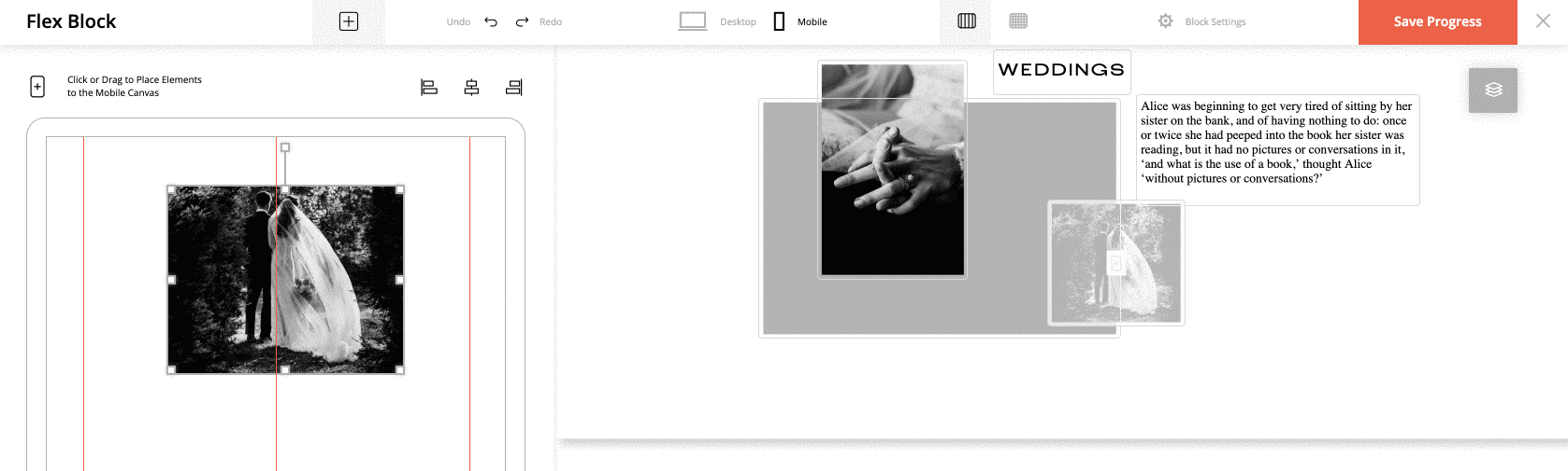
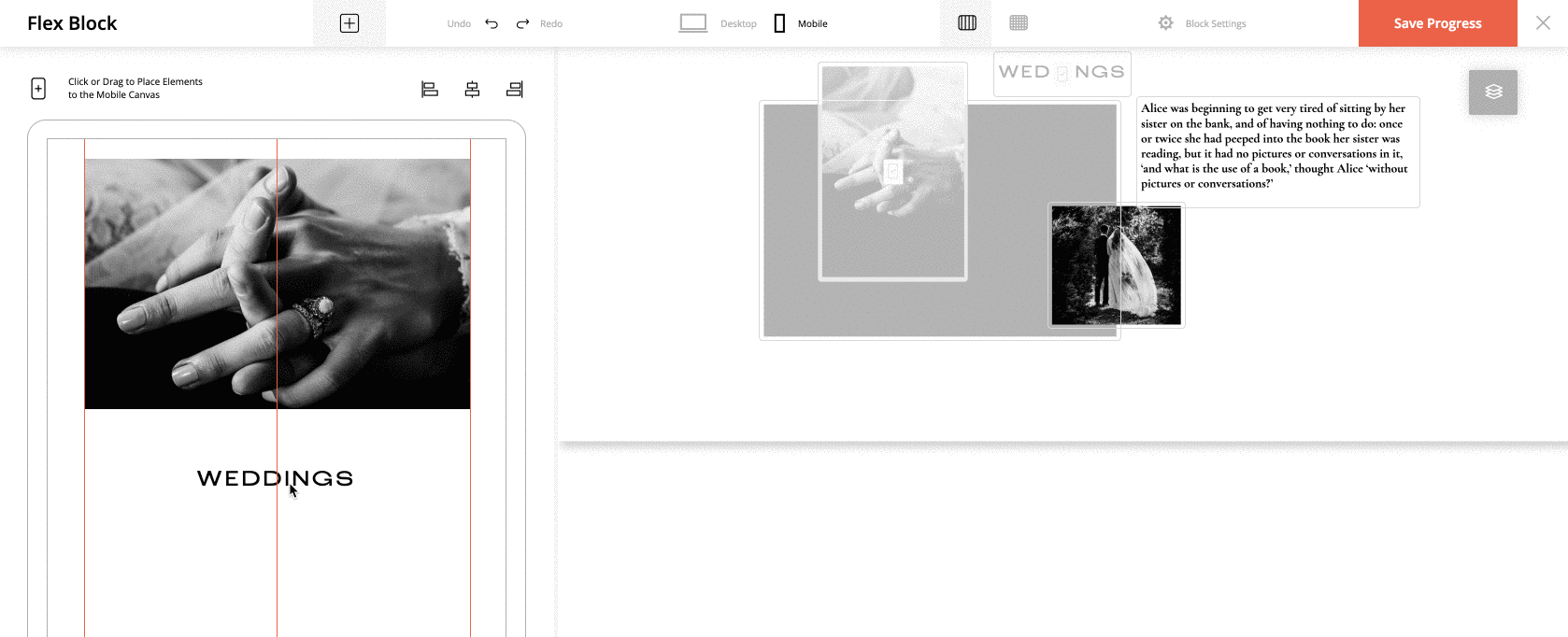
1. In the area on your right, you see the elements that you added to your desktop version. Each element has a “+” sign on top of it. These are your “bricks” to build the mobile version layout. Click on the + sign or drag & drop the elements to the mobile screen area on your left. As soon as the element is added to the mobile version, it appears as disabled in your desktop area, on your right.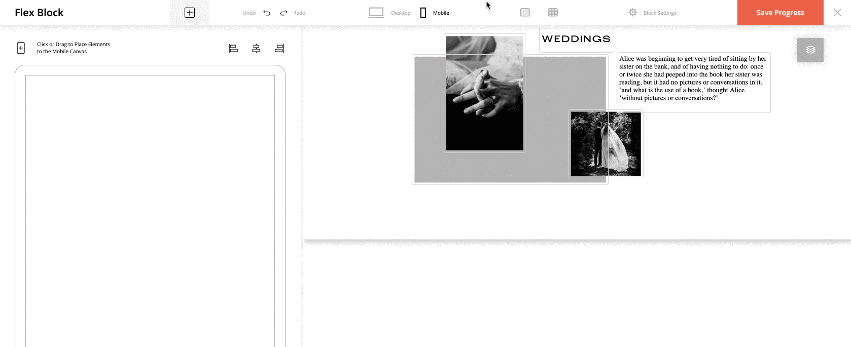
Note: You can add all the elements of the desktop version to the mobile version or just some of them. For example: if you’ve built the About Me block and added 5 images to it, you may not want to include all of them on your mobile site. Hence you can add only one and keep your mobile site version simple and easy to navigate.
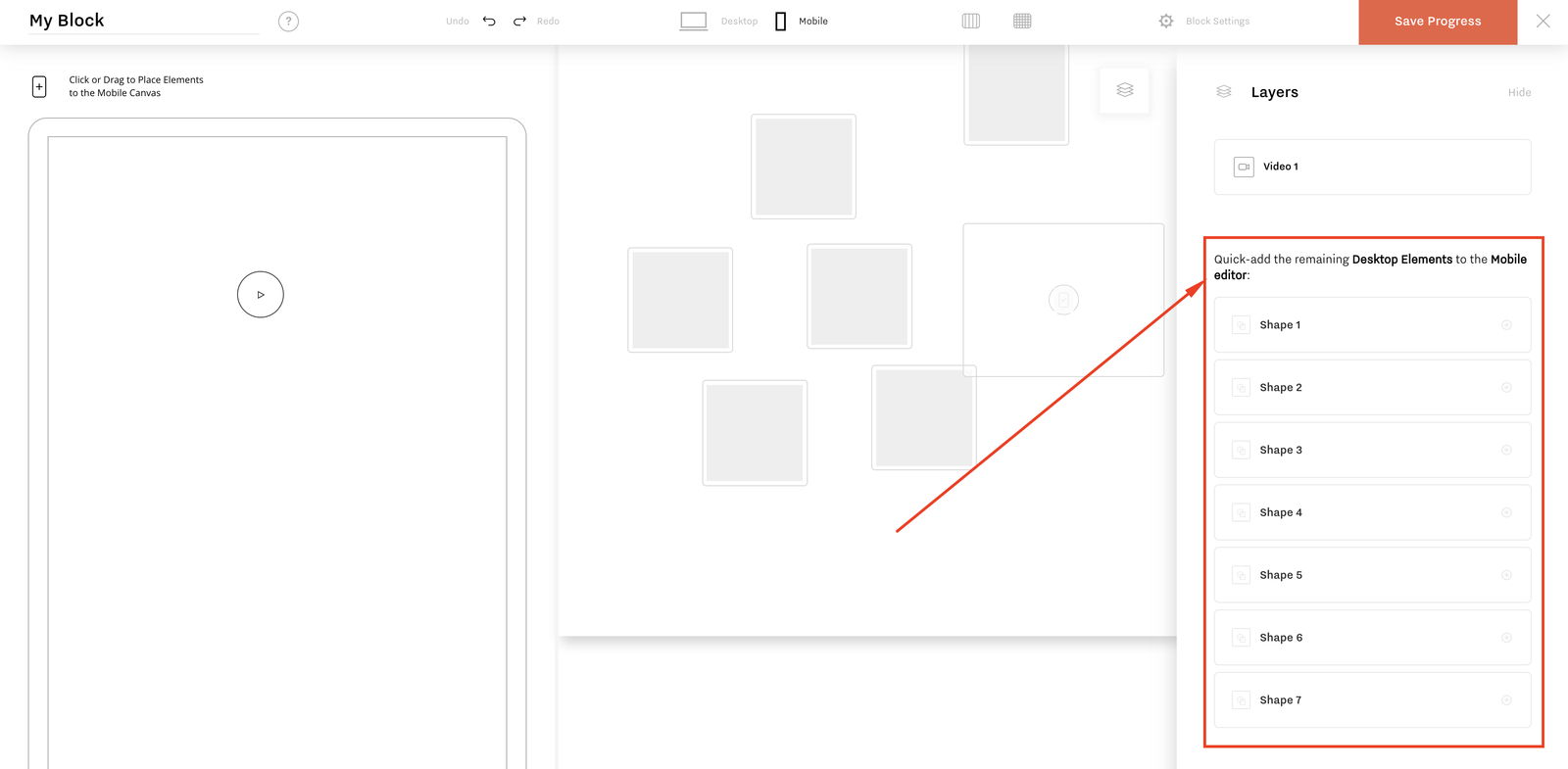
Note2: When you have multiple elements overlapping each other, and you only want to add certain ones to the mobile version of the block – things can get tricky. Especially when you need an element that lays below others that cannot be easily reached and clicked. All Desktop elements that have not been added to the Mobile View will appear in a list, below the layers. Clicking an element from this list will add it to the mobile view and remove it from this list. This allows you to easily keep track of all elements and easily sort out what’s going only on mobile or only desktop.
2. Similar to your desktop version, you have helpers for mobile – the Visual Guide and Grid tools. Additionally, you have 3 alignment options at the top – right-aligned, centered, and left-aligned. In case the Visual Guidelines are activated, left and right alignment buttons will move the element to the according line. If Visual Guide is disabled, the element will be moved to the according screen edge.
Note: For text blocks, make sure that the element’s frame fits the content inside it when you use the alignment options – since it will align the frame, not the content.
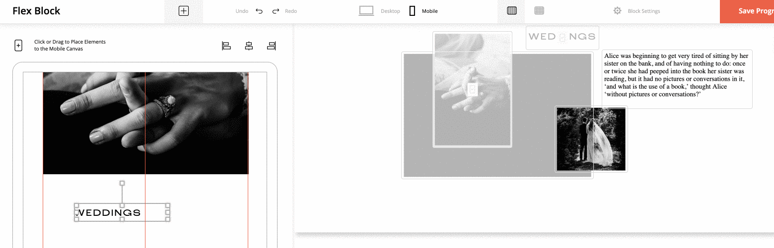
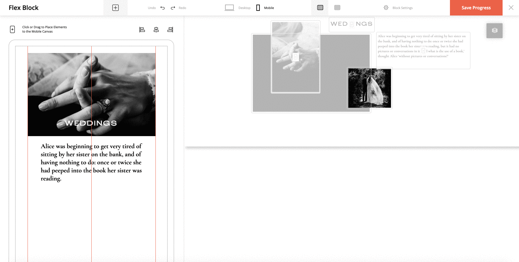
3. From the moment an element is added to your mobile area, it becomes an individual element that allows you to tweak it without affecting the corresponding desktop element. You can tweak the color, size, select a different image crop, cut part of the text, etc.
4. When all the required elements are added, check that the block height on the mobile is adjusted.
Video example of mobile version building
Check the video below to see a full process of building the mobile version of a block.
With the FlexBlock you have full control over the mobile version of your block. You can even create a mobile version that will differ from the desktop one, to provide a better user experience for your mobile users.
When you switch to the mobile tab in your top bar, the mobile version of your custom block will be empty. If you save it as it is, it will unfortunately be displayed empty on your actual website when viewed on mobile.
NOTE: Flexthemes have predefined blocks, and the mobile layout is preconfigured there. For new flex blocks built from scratch, mobile is empty and has to be built manually.
If you skip the mobile version building step (when working with flex blocks that are built from scratch), don’t expect that your mobile version will be created automatically. This is due to the extra freedom that FlexBlock offers you when designing a block. There are no rules while you create your custom block layouts (no mater how unreal your idea is). Hence, moving such content automatically to a mobile version can lead to unexpected results.
But worry not, we plan to build some smart solution for this with our next FlexBlock version. For now, we’re keeping it simple as you’re getting used to working with this amazing & powerful tool.
Building the mobile version
Building the mobile version is not complicated and doesn’t force you to recreate the content. However, you will need to build the layout for mobile:
1. In the area on your right, you see the elements that you added to your desktop version. Each element has a “+” sign on top of it. These are your “bricks” to build the mobile version layout. Click on the + sign or drag & drop the elements to the mobile screen area on your left. As soon as the element is added to the mobile version, it appears as disabled in your desktop area, on your right.
Note: You can add all the elements of the desktop version to the mobile version or just some of them. For example: if you’ve built the About Me block and added 5 images to it, you may not want to include all of them on your mobile site. Hence you can add only one and keep your mobile site version simple and easy to navigate.
Note2: When you have multiple elements overlapping each other, and you only want to add certain ones to the mobile version of the block – things can get tricky. Especially when you need an element that lays below others that cannot be easily reached and clicked. All Desktop elements that have not been added to the Mobile View will appear in a list, below the layers. Clicking an element from this list will add it to the mobile view and remove it from this list. This allows you to easily keep track of all elements and easily sort out what’s going only on mobile or only desktop.
2. Similar to your desktop version, you have helpers for mobile – the Visual Guide and Grid tools. Additionally, you have 3 alignment options at the top – right-aligned, centered, and left-aligned. In case the Visual Guidelines are activated, left and right alignment buttons will move the element to the according line. If Visual Guide is disabled, the element will be moved to the according screen edge.
Note: For text blocks, make sure that the element’s frame fits the content inside it when you use the alignment options – since it will align the frame, not the content.
3. From the moment an element is added to your mobile area, it becomes an individual element that allows you to tweak it without affecting the corresponding desktop element. You can tweak the color, size, select a different image crop, cut part of the text, etc.
4. When all the required elements are added, check that the block height on the mobile is adjusted.
Video example of mobile version building
Check the video below to see a full process of building the mobile version of a block.