FloForms - Creating Forms
In this article, we will go over how to create forms and review all available settings & options inside a form’s editing page.
Create a Form
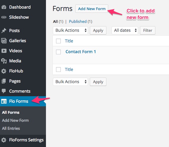
Now that the plugin is activated, it’s time to create a new form.
Go to the FloForms area in your WordPress backend, and click “Add New Form”:
You will then be presented with a blank form, with only a submit button. Enter the form title, and then you will be able to select any of the options from the left-hand side to add as inputs to your form from the add a field tab:
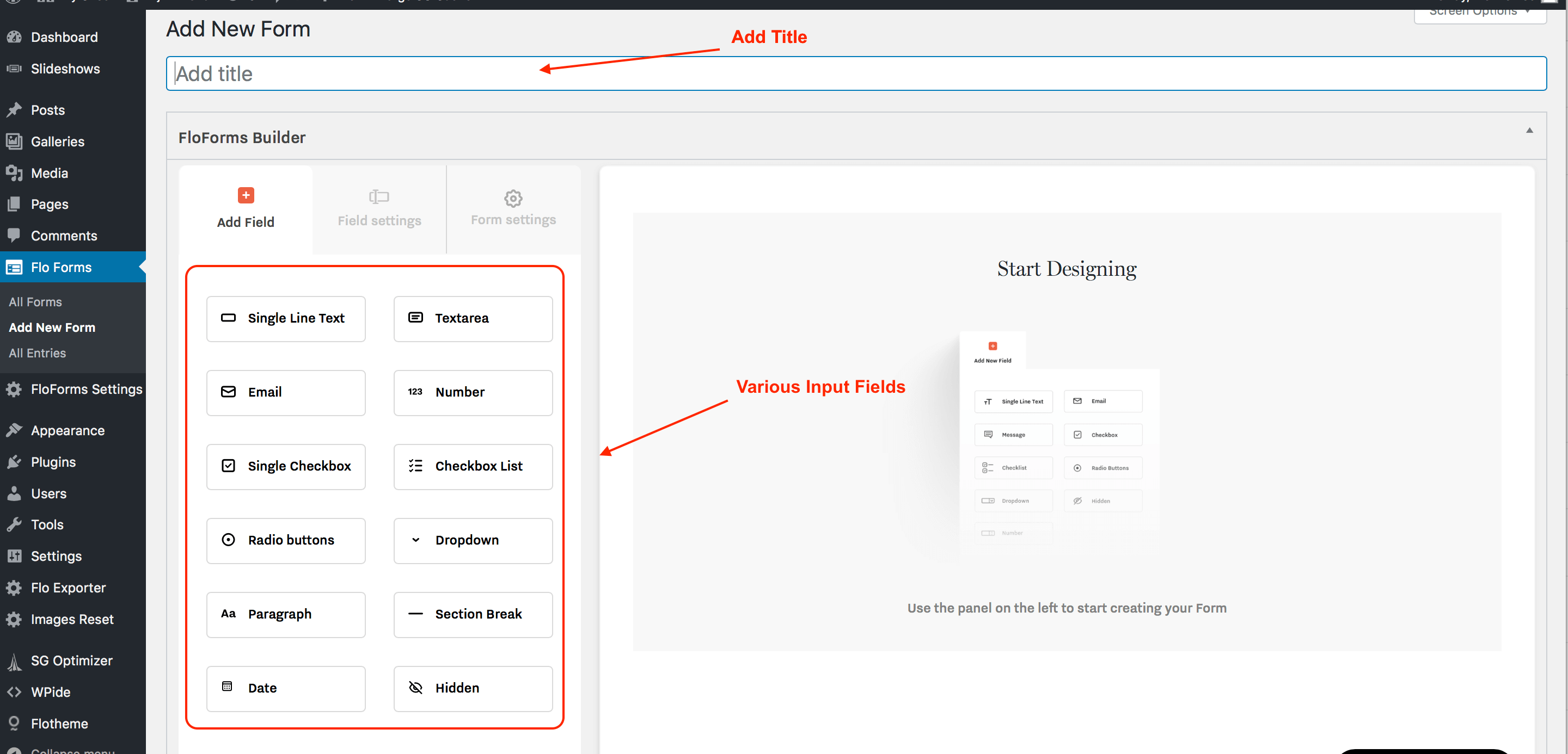
The following inputs are available:
The next section explains in more detail each input field.
Available Fields
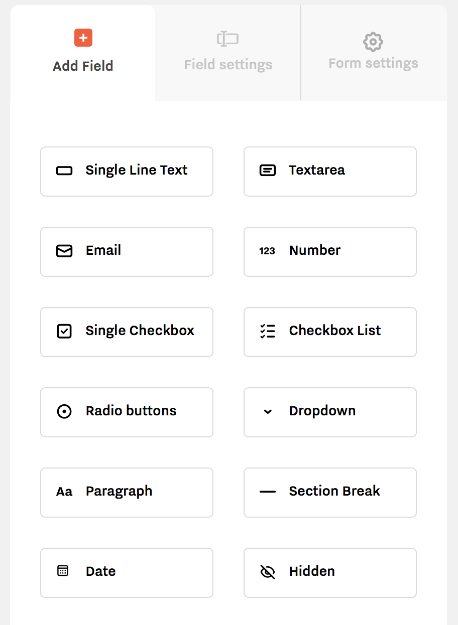
The following fields are available for your contact form.
Single-Line Text – this field will allow one single line of text, useful for short text items such as name, venue location, etc.
Text Area– this field will allow a larger paragraph of text, generally used for sections where you require more information.
Email – the email tab for the user’s email.
Number – this field allows only numeric inputs, ie. number of guests.
Single Checkbox – this field allows you to add one checkbox option.
Checkbox List – the checkbox field allows you to add checkboxes for your site. This is a multiple selection option list. This is great if you want to find out some specific information, such as additional services.
Radio Buttons – the radio button field offers a selection of options, allowing the user to select only one option from the list.
Dropdown – the dropdown menu is the same as the radio button, allowing the user to select only one option for a presented selection of options. On the front, it appears as a dropdown.
Paragraph – this is not an input field as such. This is used for any descriptions, disclaimers, notes for the user either before a specific field or as general information.
Section Break – This will add a break line in your form.
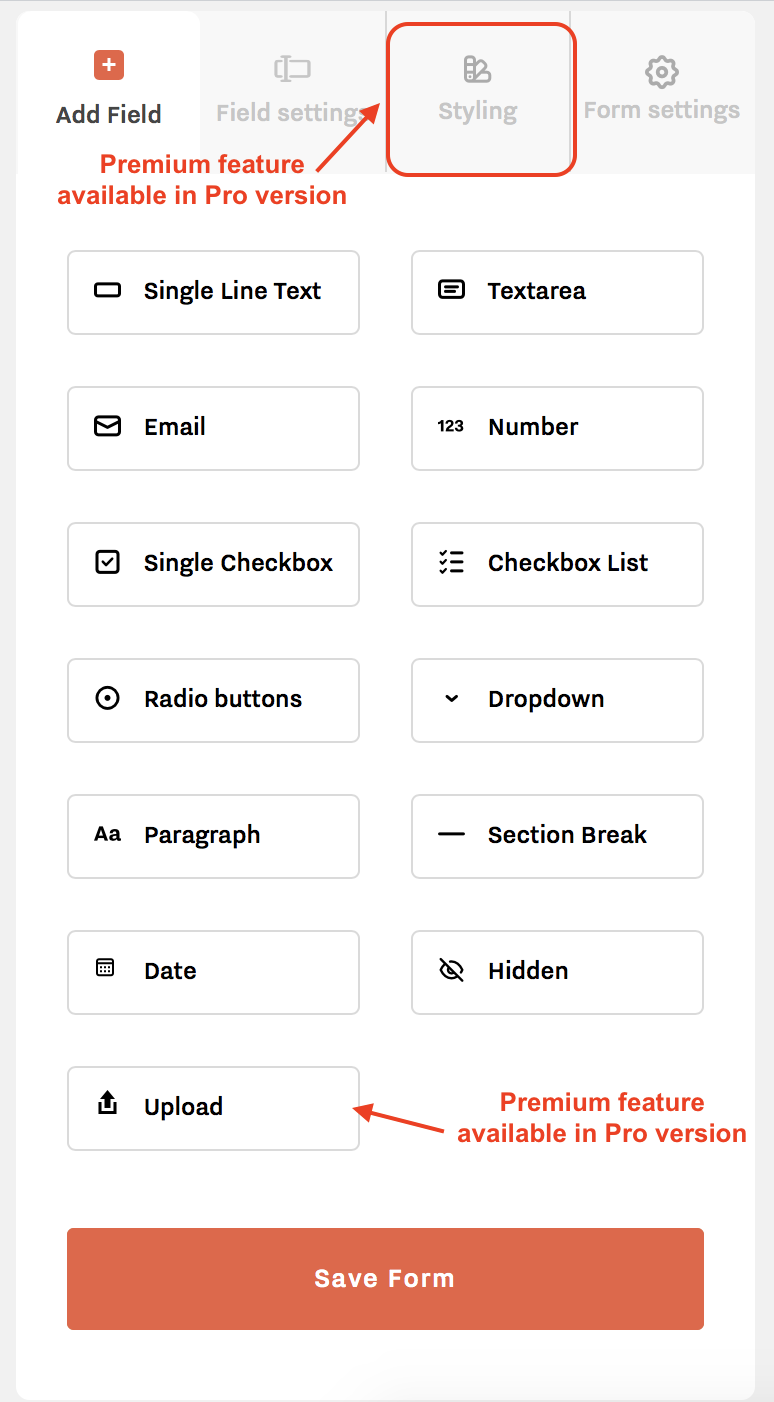
Date – this will add a date picker to your form.
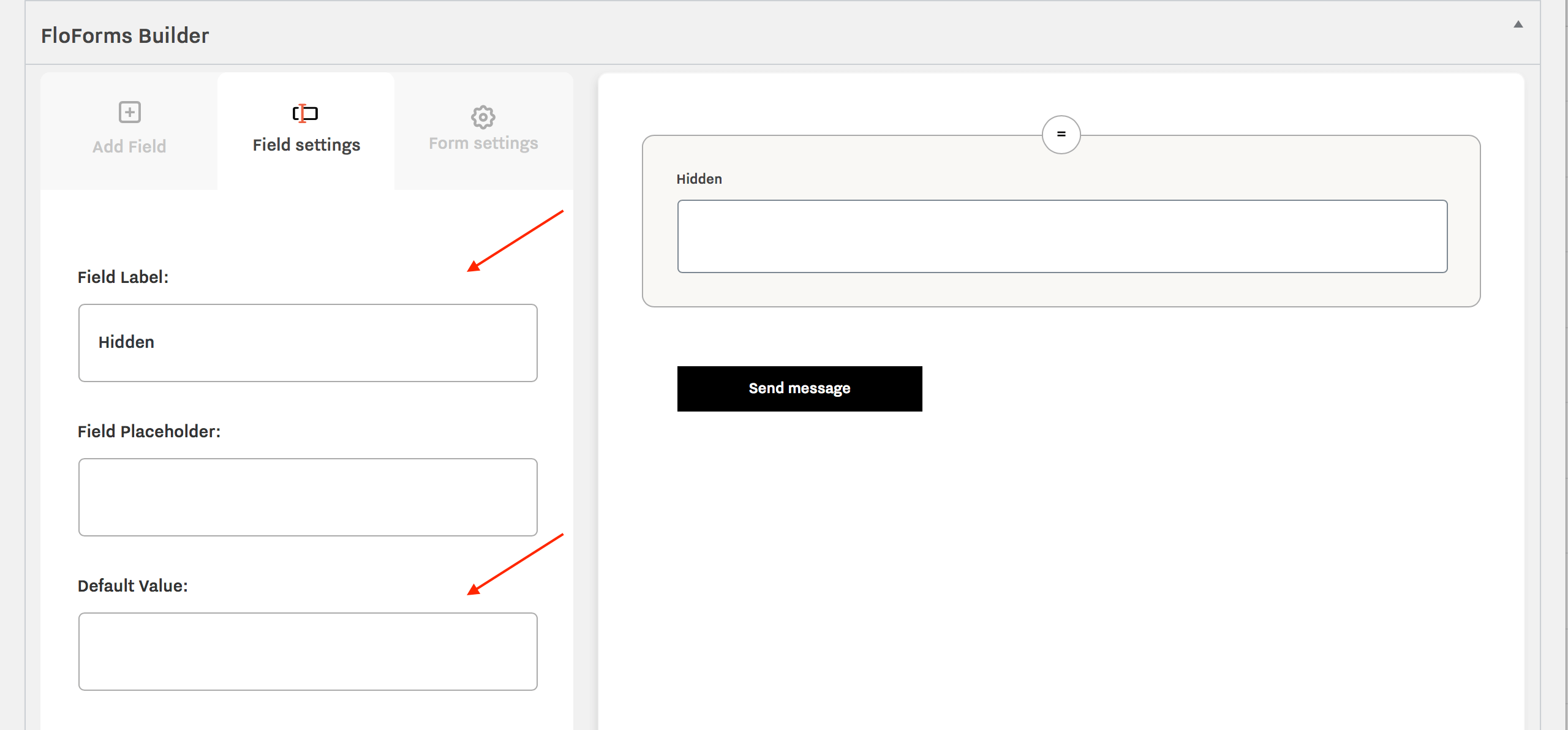
Hidden – this field is particularly useful when integrating your form with ShootQ and Tave and you need to pass some hidden information on the user.
Upload – this field is a premium feature inside the Pro version, which allows you to ask your users to upload files to the form. Read more on Pro feature versions here.
Add a label, this will be for your own internal use, and then add a value that you wish to pass.
The next section explains how to add fields and the settings tab.
Adding Fields and Field Settings Tab
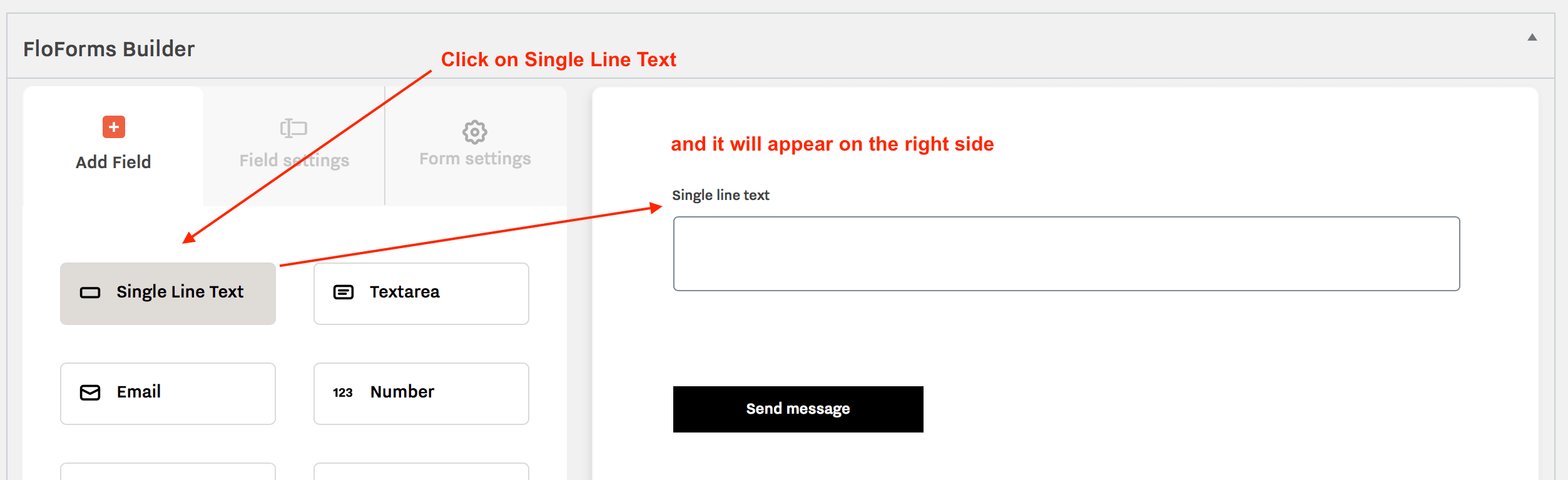
Adding inputs to your FloForm is simple, just click any item in the Add Field section on the left and it will appear on the right-hand side. Select all the input options as required, or add one at a time. From here you can edit the specific options related to the input:
Field Settings
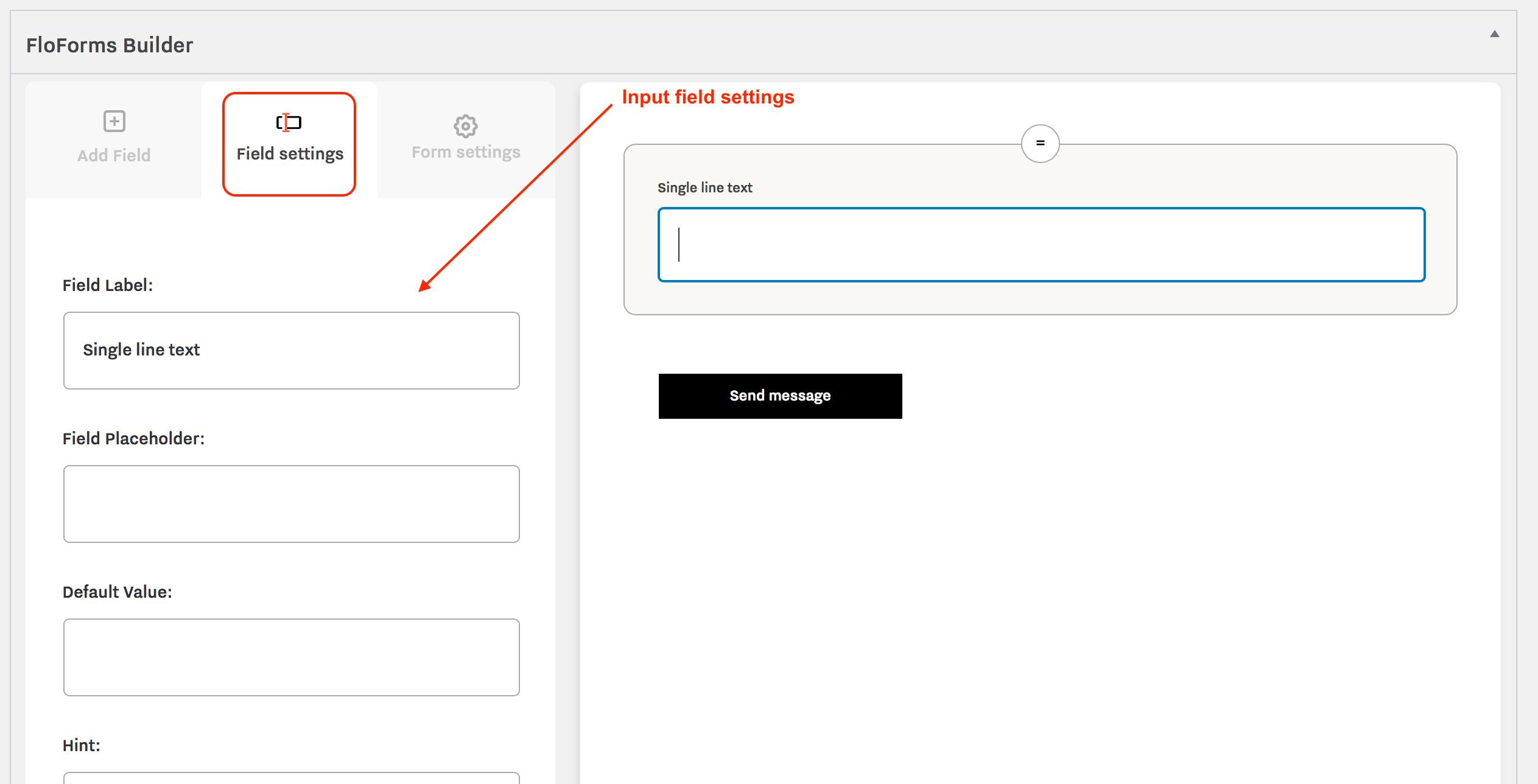
To change details about the specific field, click the item on the right-hand side, it should then be highlighted in a light grey color, and on the left side it will open the Field Settings tab with all settings available for the selected field:
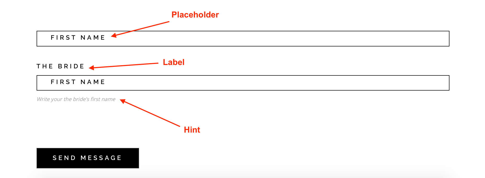
You can choose to add field label, field placeholder and a hint, or keep the input clean and just keep the placeholder text for the field. Check the screenshot below for all options filled out:
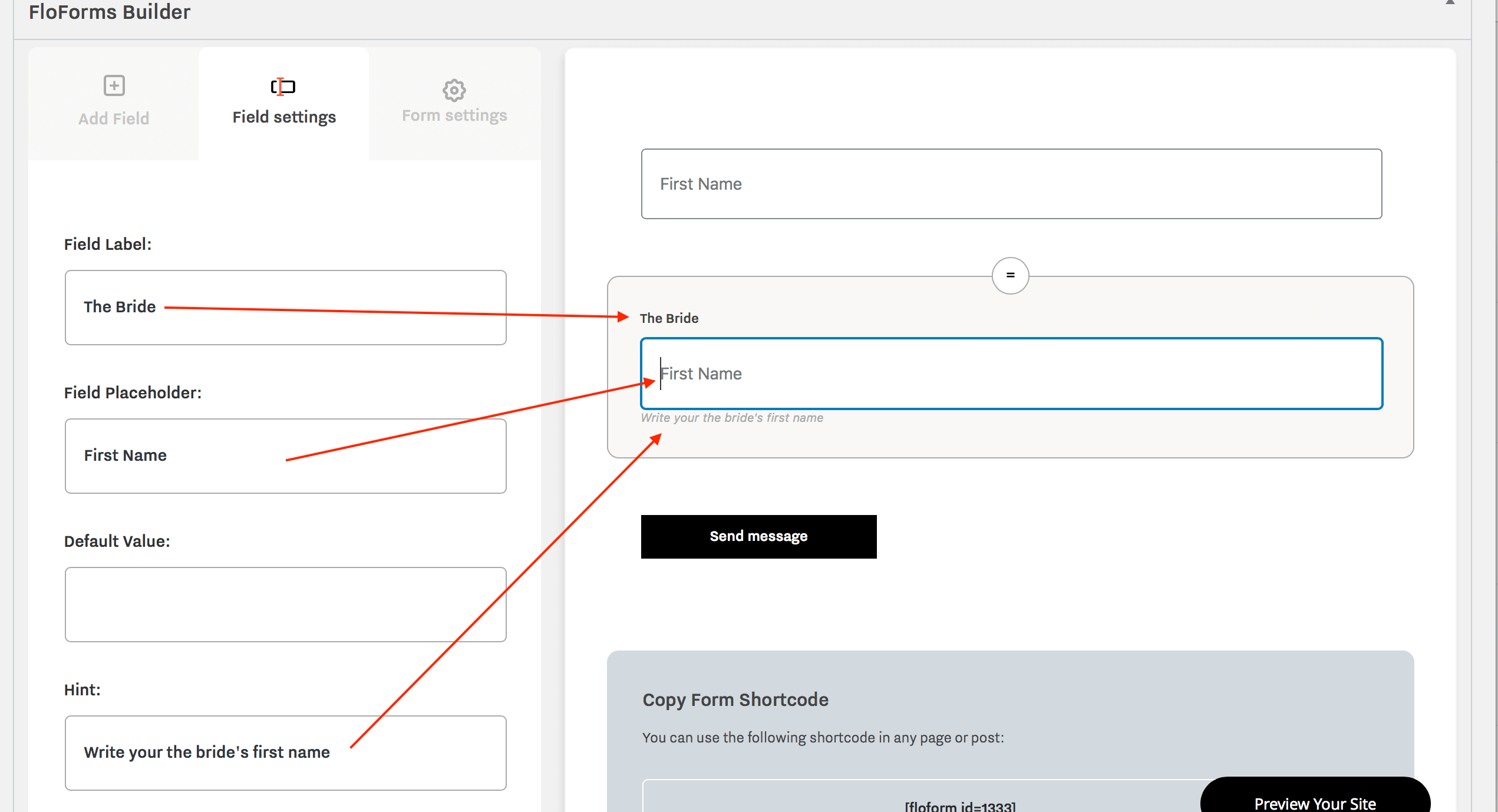
Below is an example of two fields where one only has a placeholder added, and another with placeholder, label and hint:
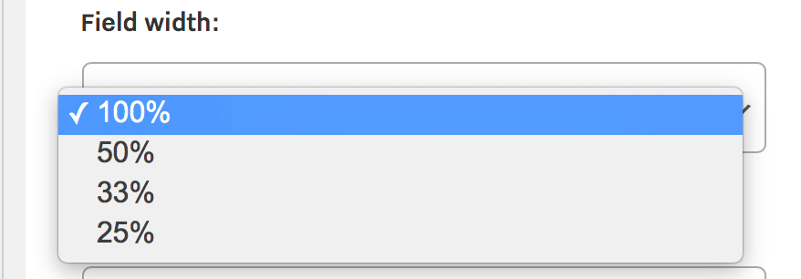
In the Field Settings tab, you can also select the width of the field, ie. 100%, 50%, 33% or 25%. This gives you an option to have 1 field per row, 2 fields, 3 fields or 4 fields.
In the Field Settings tab you also have the following options available for all input fields:
– add a CSS class (advanced) if you wish to style a particular field further
– enable the field as required
Some of the input fields have their specific settings which are additional to the ones described above.
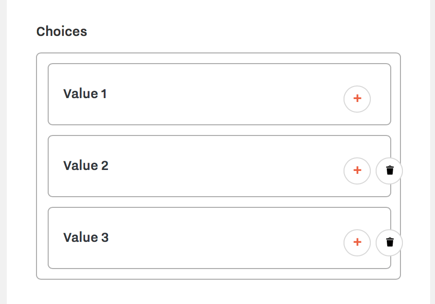
Checkbox List, Radio Buttons, Dropdown- have a setting to add values for the options you want to present.
Date – here the settings allow you to select the date format that you prefer for the input field and the calendar view start day. In the Date Format dropdown, the last option is Custom Setting, which you can edit from FloForms Settings (covered in the next articles).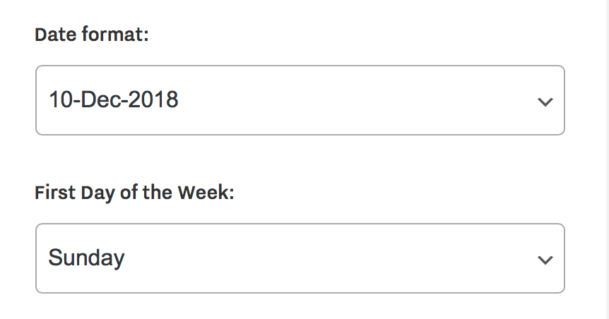
Section Break – here you will find the option to set the space before (top margin) and after (bottom margin) the line break.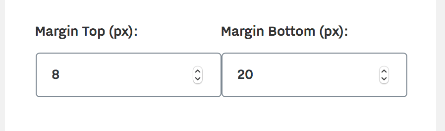
Button – when you click on your Submit button on the right side, you will also find settings related to this element on the left side under the Field settings tab. Including text, alignment (auto, left, center or right), and button text & background colors.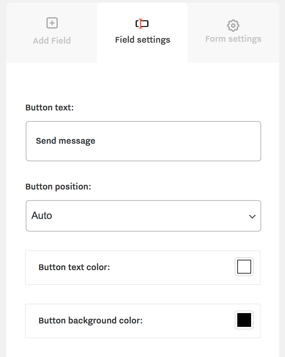
Repeat the process to add all the items to your form. If you want items in 2 columns, make sure to use 50% width or check the option in the Form Settings tab (described in the next article). Once you have built the form, added the labels and set the widths etc, you will need to set up the final tab form settings, explained in the next section.
Conditional logic
The Conditional Logic option can be used to show and hide form fields based off on the user’s inputs.
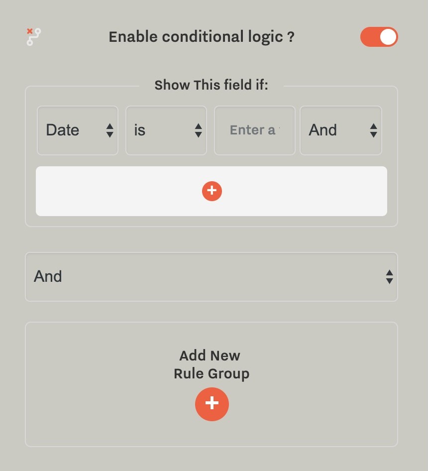
Note that for the Checkbox field type, the value you should check against is ‘true’
Styling Tab
This is a premium feature available in the Pro version. It allows you to edit font styles, paddings, colors, and button styles. Read about the editing options inside the Styling tab here.
Form Settings Tab
The form settings tab is the final item required to set up the form before adding it to a page. Here you can set the email where your form is sent (this will be your email), the email subject, form columns (general settings for 1 or 2 columns), options for confirmation: a simple text message, or you can re-direct the user to another page. You can also enable the option to send a Confirmation Email.
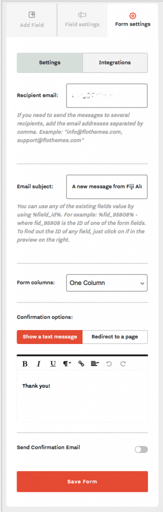
The first thing to do is to add your email to the “Recipient Email” section, then select the email subject. Generally “Contact Form Message” will work well. The email subject can be customized using the values from the existing fields. For example, you can use the field ID from your Name input field. The field ID can be found on the right side when the field is clicked:
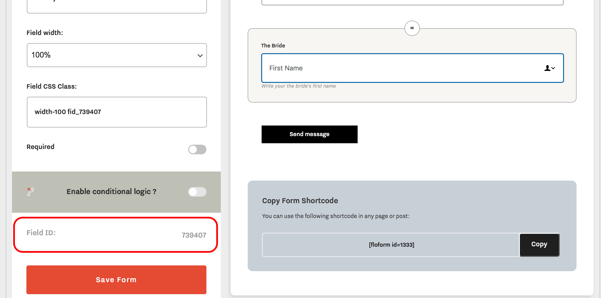
So for example, if the user will type in the ‘Name’ field ‘Jane’, and your email Subject is set to “A new message from %fid_739407%, then the email subject, in this case, will be ‘ A new message from Jane‘. If necessary you can use several fields in the subject line.
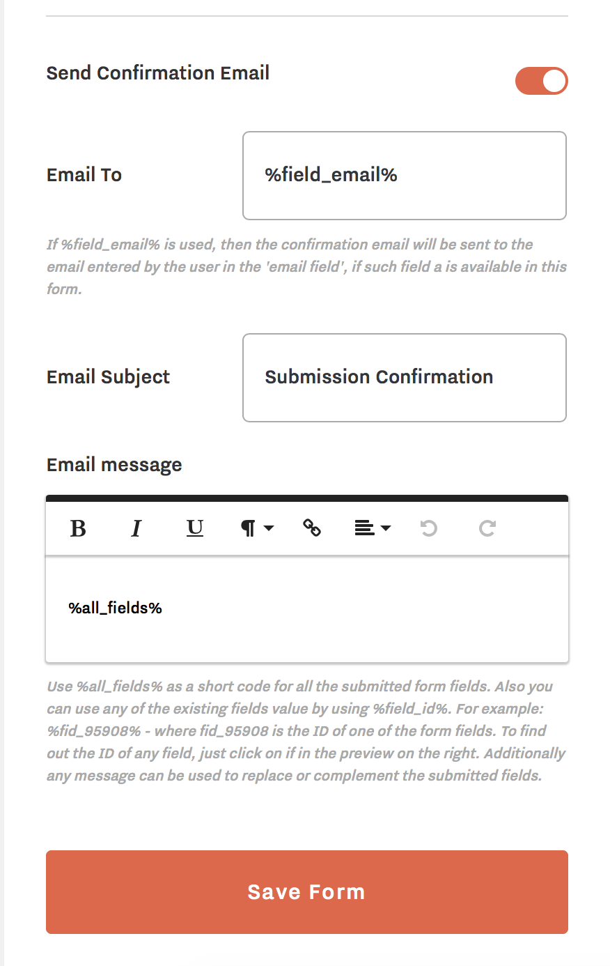
If you enable the option to send a confirmation email it will expand additional settings:
Once you have filled out all the settings make sure to click on Save Form.
Integrations
Inside the Form’s settings, you can also add integrations with third parties. Access documentation on Slack integration, Mailchimp Integration, and Twilio integration.