Using templates & blocks
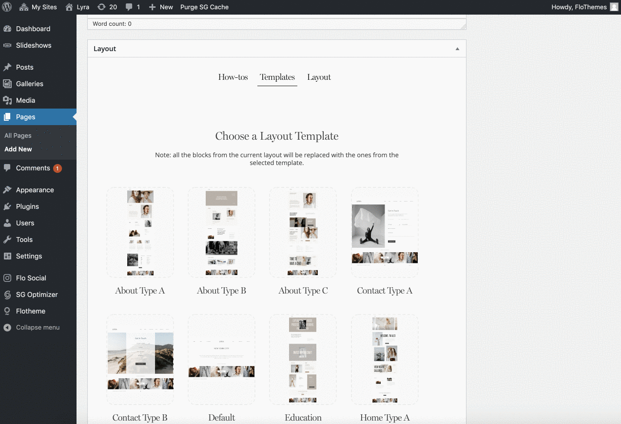
A Page Template is a pre-designed page layout that can be used for creating different pages such as Homepage, About, Contact, etc. Each theme includes a variety of different Page Templates to choose from.
With new Flex Flothemes, there is only one difference in templates usage in comparison to regular themes. Here, in some of the templates, you will find a combination of WP base blocks and Flex blocks, that will either open you some fields to populate or select from in case of WP base blocks or a flexible builder in case you open a Flex block to edit it.
When you apply the template, you will see the badges WP or FLEX that will indicate what type of block it is.
Our predefined Flex blocks are a new feature that is available within FlexThemes only.
The blocks provide the layouts for various types of content, however, in comparison to blocks from our Classic Themes, the layout here is not fixed but is fully flexible. You can apply the block and tweak the layout the way you want – remove or add more images, reposition elements, resize the block, and so on.
Besides the desktop layout, you will additionally get a predesigned mobile layout, that you can also tweak and adjust separately from the desktop one.
Let’s go through the process of using the predesigned Flex Blocks:
Adding the block
If you are creating the new page from scratch, or want to extend the provided template:
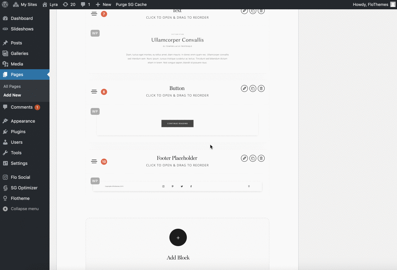
- at the bottom of Layout tab, click Add Block and select Flex Block;
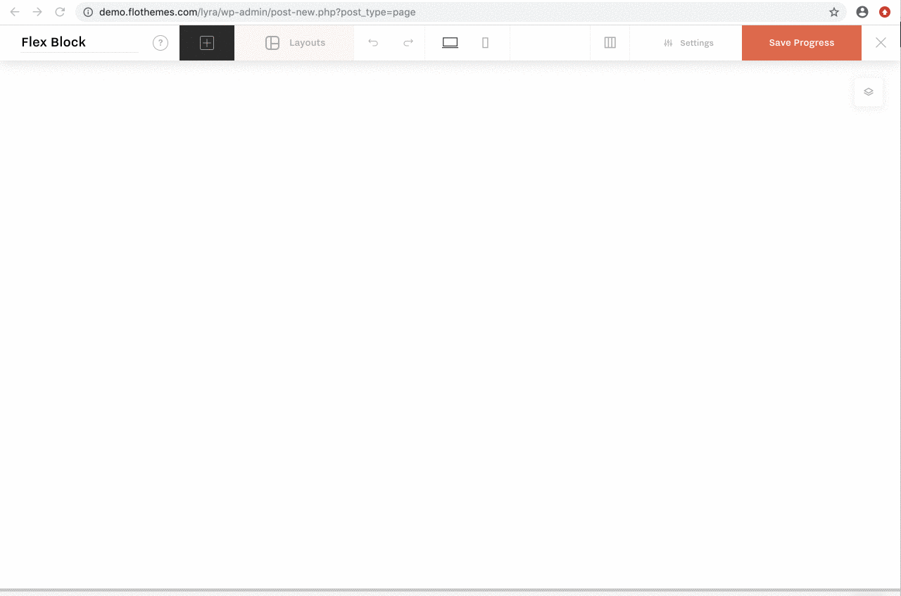
- open the Flex Block builder and click the Layouts button in the top bar.
Applying the layout
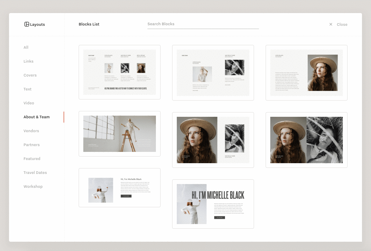
When the Layouts popup is opened, you will see a list of the predesigned blocks.
Under ALL tab you will see a list of all blocks, alternatively, they are split by groups as Links, About, etc. The blocks are grouped in categories, however, these are not exhaustive and we recommend adjusting and adapt blocks based on your content needs.
When you select a block, you will see a bigger preview of the layout. Here you have additional navigation to scroll through the blocks to finally select the one that works the best for you.
Working on desktop content
When you add the block, it will be applied with a dummy content. The images that you see in the preview will be replaced with grey placeholder images. Now you can work on the content and replace the dummy content with your real content, ie. images, text, links, etc.
In case your content doesn’t fit the layout perfectly, adjust elements as you require – move elements, resize images, etc.
Working on mobile content
The mobile content is automatically synced with the desktop one, there is no need to work on your mobile content separately.
When the desktop version is ready, make sure to switch to the mobile version and check if the page is looking good. Usually, you might need to tweak element sizes and positions for texts.
In case you want to make some element of the block different for mobile version only (e.g. have less text on mobile) open your Flex Block, switch to mobile, select the element and disable Desktop Sync.
Add the content you prepared for your mobile version, save the block, update the page & check the new block on the final page.